PMS
UX design, UI design, Visual design
2020
PMS is a React-based platform designed to manage legal matter on a clear, modern and fast-loading interface.

Process
The complete businesss workflow has been mapped against the proto-personas
A deep-dive in the business workflow and existing tools has been conducted to understand the current situation and the problem statement.
Proto-personas have been used as starting point for the user interviews which have been instrumental in identifying pain-points and possible edge cases.
User journeys have been utilised as the basis for design sprints. In conjunction with this process a lean UX approach was also used. This involved creating a sequence of prototypes followed by frequent user testing allowing for quick results.


Research
Competitors research and feature mapping
More than twenty existing products in the market have been analysed and their features and interaction patterns highlighted. The research has been utilised as a base for the features required for the MVP.
The features have been prioritised based on the empathy map, paint points and development effort.
The competitor research also led to a UI element collection which has been used as a foundation to identify the React library.


Design System
A Design System has been created based on the model of Atomic Design.
The UI guidelines are based on nested elements has been creating in Figma to make the design process agile and consistent in every page.
Typographic hierarchy and colours scheme has been designed and tested to ensure accessibility according to WCAG standard.
Design tokens have been defined to ensure consistency and facilitate the handover with the developers.

UX for API
The UX design maximised the ability of React to display the information efficiently and minimise the loading time.
The main data needed for the user to complete the task are loaded first while the sidebar is rendered after the content section so the user can have access to the page instantly.

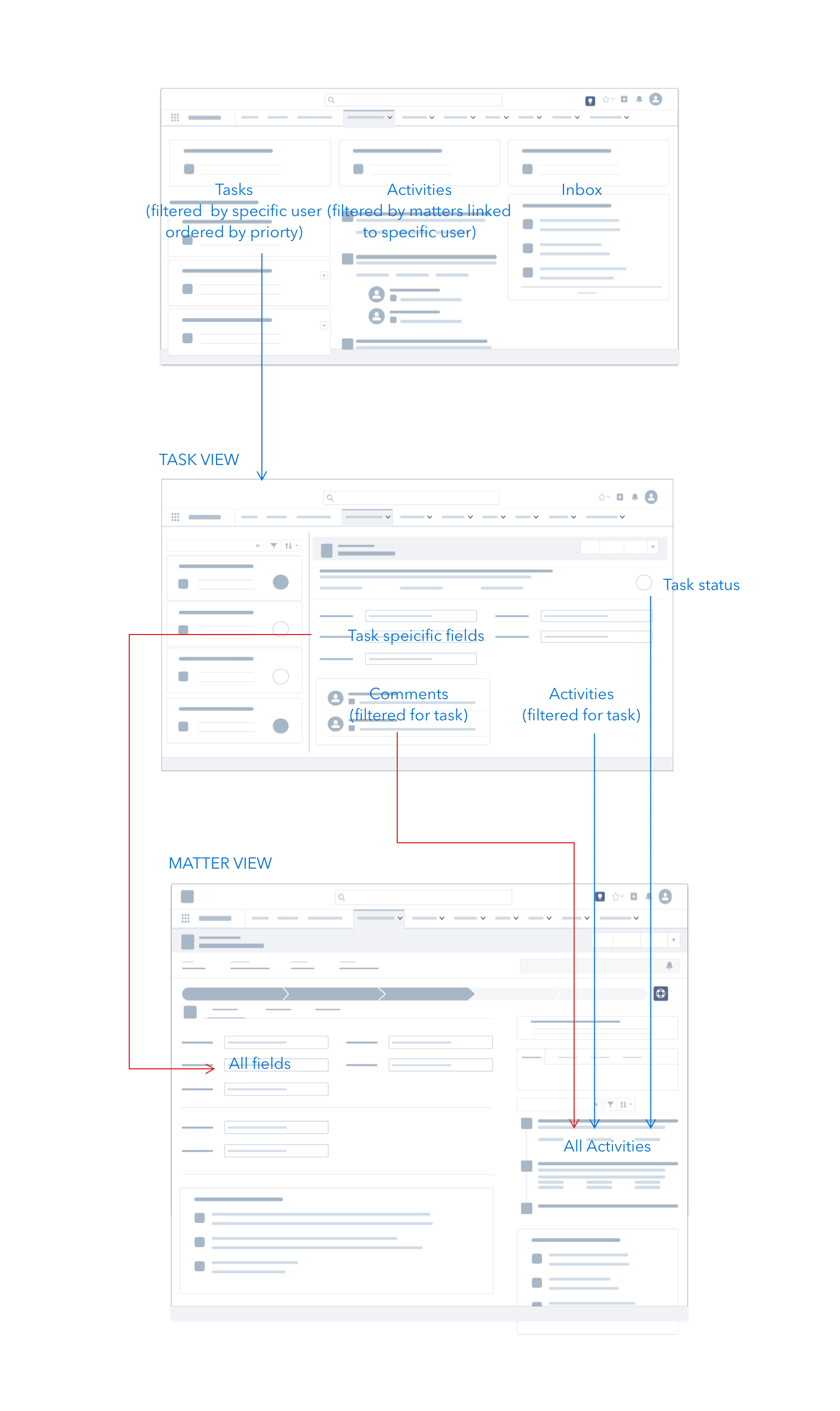
UI structure
The UI structure is designed to host a large amount of information and actionable tools without compromising the loading speed.
The input fields are displayed on the left side, organised in tabs and accordions so the user can navigate the information efficiently. At the same time, the tabs also improve the data loading via API.
Supplementary pieces of information are hosted in the sidebar. At the bottom of the screen, a footer bar gives access to tools such as inbox, VoIP call integration and calendar.
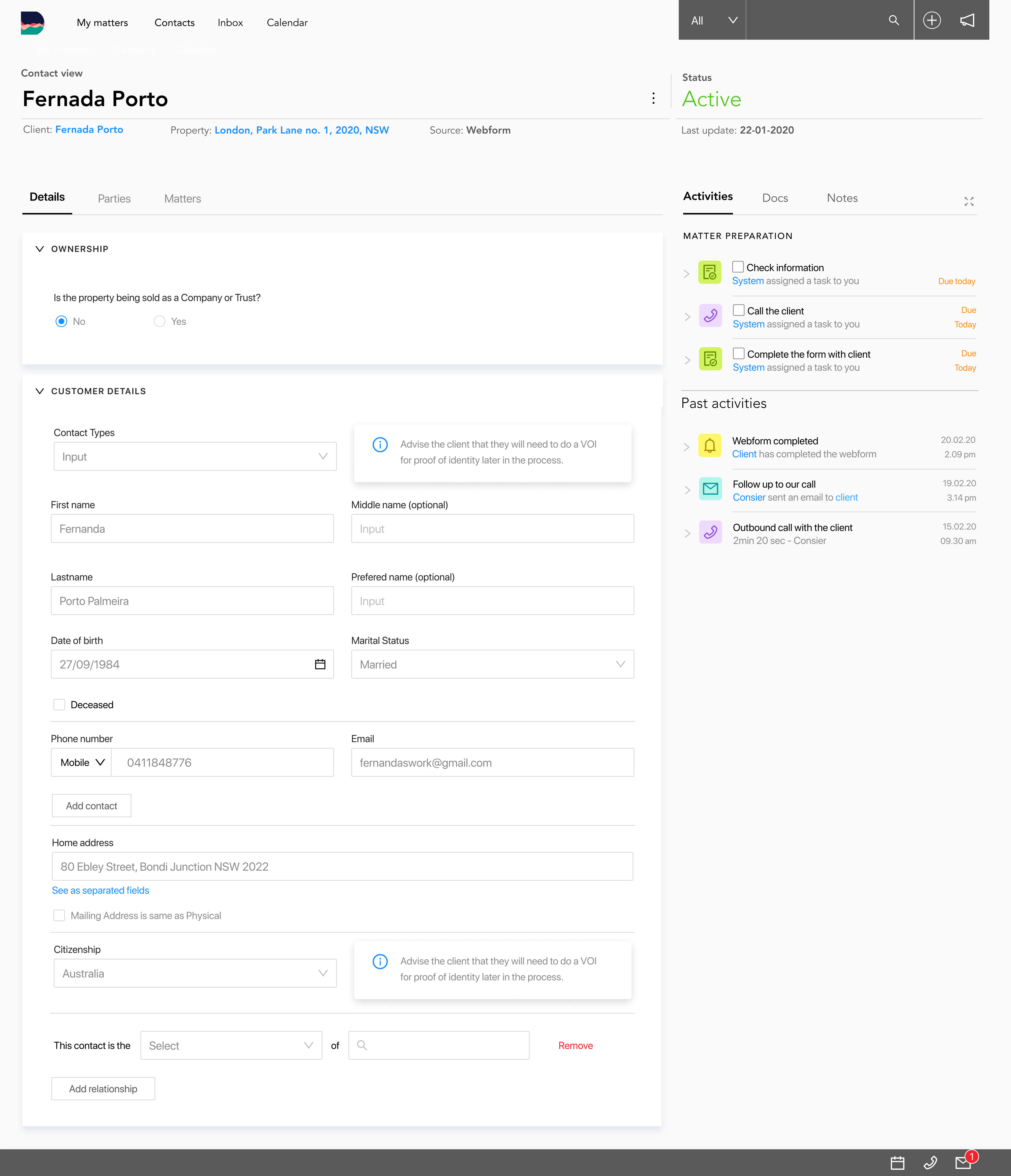
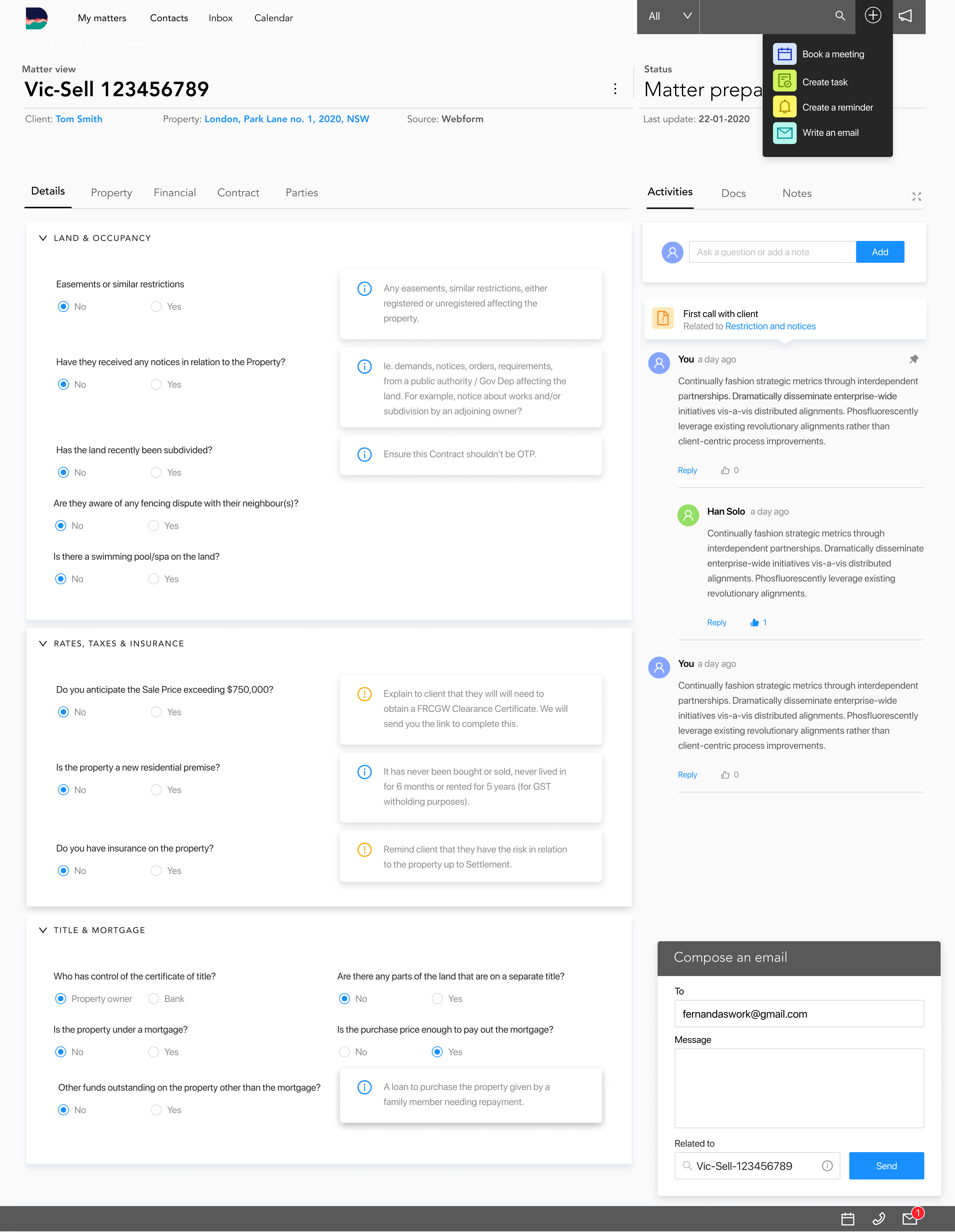
Conditional states and notifications
Notifications are grouped in to categories by coloured icon, giving immediate feedback to the user
Conditional rules are applied to some fields. Notifications are used to give additional information related to the value selected and the new fields displaid. The user can easily identify the nature of the notifications by refering to the coloured icons.

ComponentsThe components are designed to reduce the number of elements in the interface without compromising the user interaction.


Tooltips
Tooltips display relevant information to the user and deliver a fluid experience minimising the waiting time.