DPN
— Property Investment Plan
Art direction, Graphic design2017

DPN is a property and finance company which provide for their clients with a Property Investment Plan as a clear guide for their investments.
Awards and recognition
Silver - Sydney Design Award 2016
Related projects
DPN — Website


Bold and elegant
A strong contrasts are at the base on DPN visual identity. Miller, an elegant sharp serif meets Schulbuch, a bold large-size serif font.
A strong contrasts are at the base on DPN visual identity. Miller, an elegant sharp serif meets Schulbuch, a bold large-size serif font.


Easy to navigate
Each section is clearly identifiable. The grid and typography is designed to help the reader easily navigate the information.

 Visually engaging
Maps and info graphics are used to convey complex information in an engaging and accessible way.

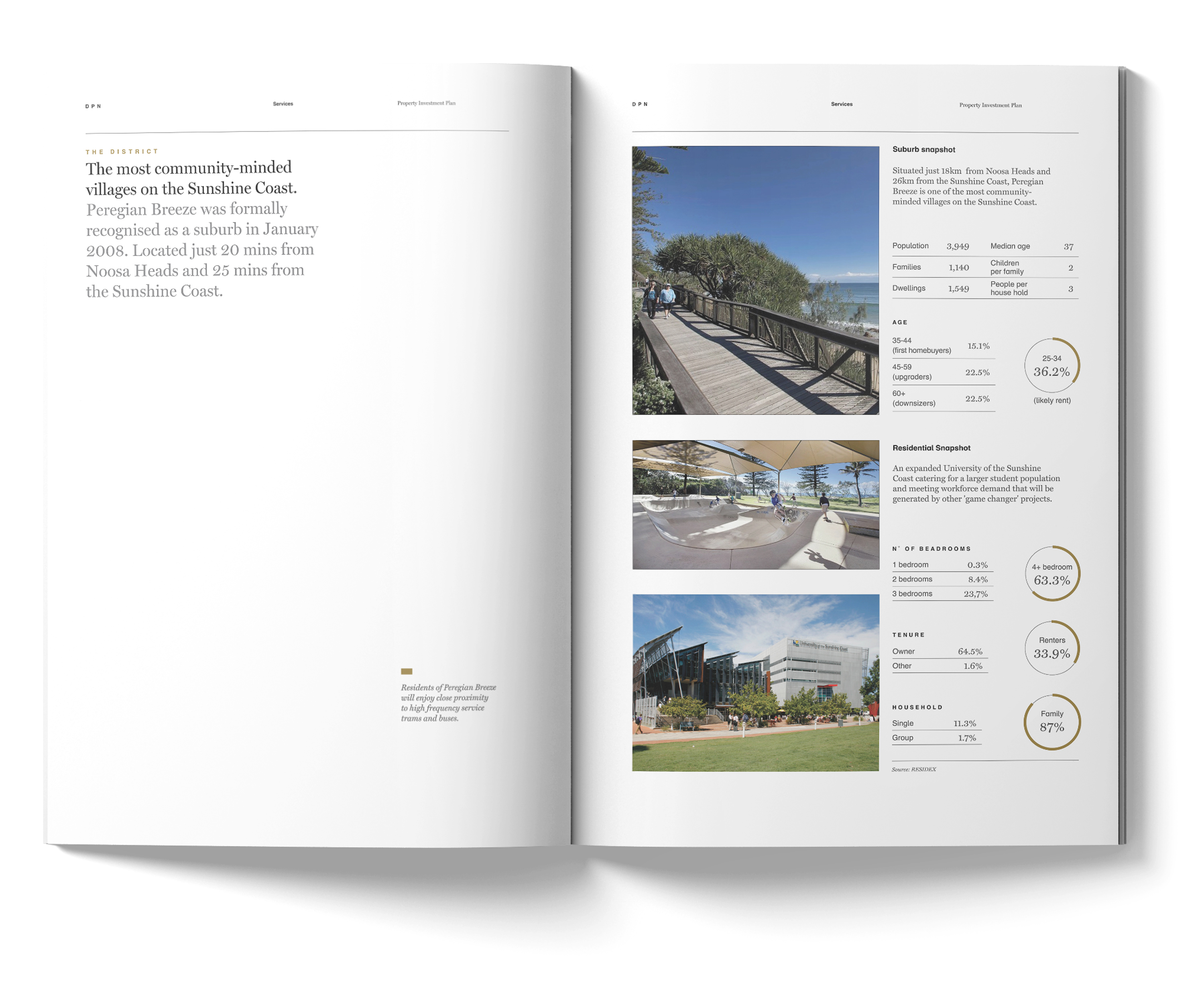
Complex made simple
Charts and table are used to create a clear visual hierarchy to help the reader focus on the data that matters.
