DPN
Art direction, Branding
2015
An elegant and exclusive brand identity for DPN, a property investment and financial service company based in Sydney.
Related projects
DPN — Website
DPN — Your journey
Awards and recognition
Silver - Sydney Design Award 2016


 Letterhead with envelope
 Business cards
Stationary
A gold brick is used to represent the success in property investment while a deep black is used to convey a sense of elegance and exclusivity.
A gold brick is used to represent the success in property investment while a deep black is used to convey a sense of elegance and exclusivity.
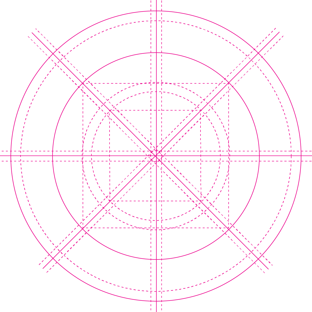


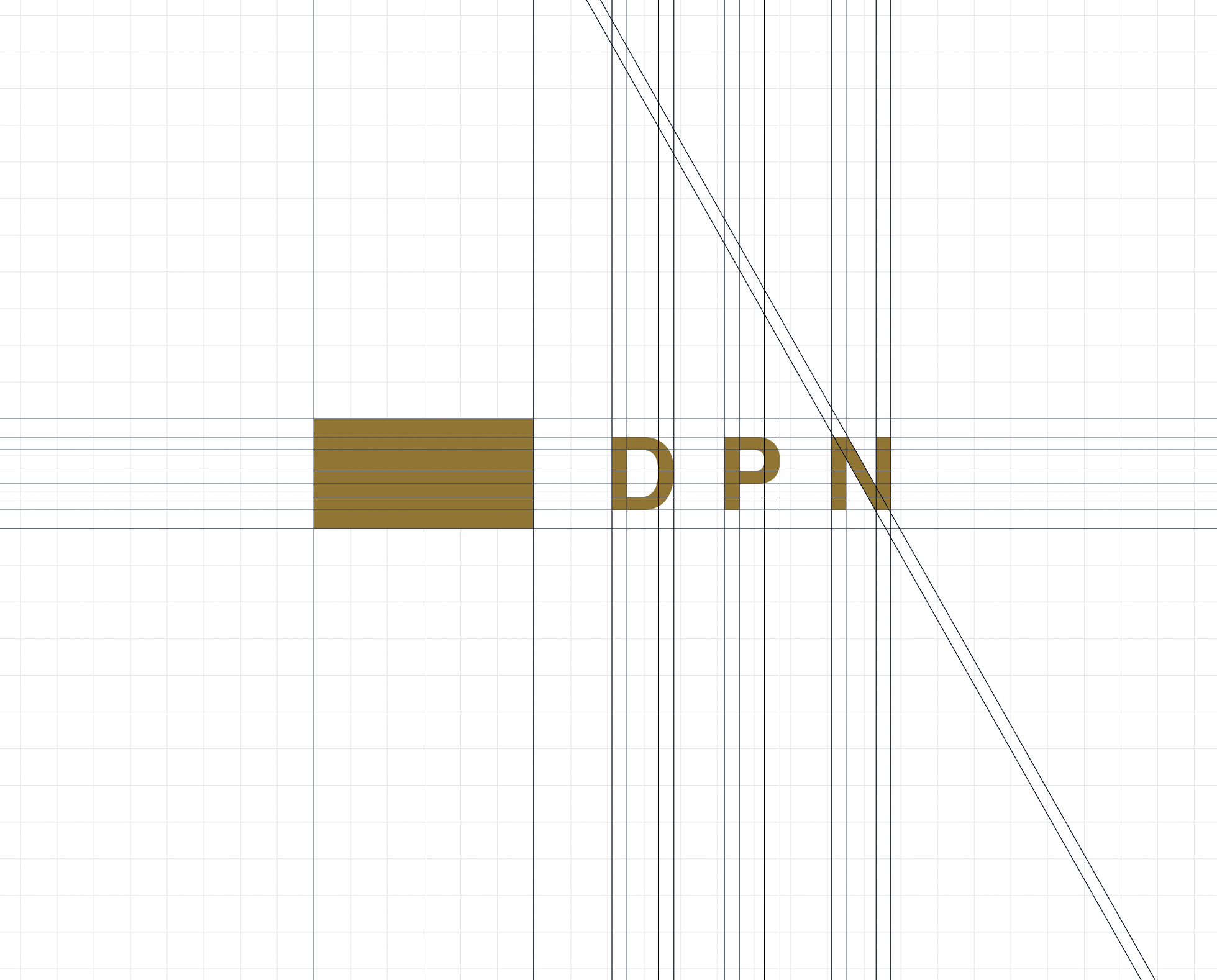
Grid and icon system
A versatile grid system has been create to ensure consistency in all the DPN visual language: from icons and illustrations to complex print and digital applications.
A versatile grid system has been create to ensure consistency in all the DPN visual language: from icons and illustrations to complex print and digital applications.


Photography
The brand colours (gold, white and black) and their shades are often present in DPN photography. Modern architecture with emphasis on straight lines and a deep prospective characterise the brand.
The brand colours (gold, white and black) and their shades are often present in DPN photography. Modern architecture with emphasis on straight lines and a deep prospective characterise the brand.
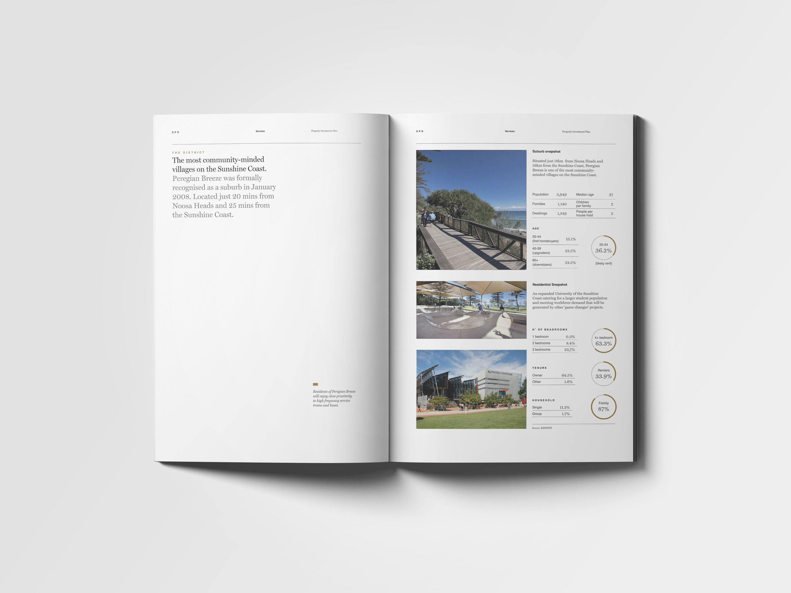
Property Investment Plan
The Property Investment Plan has been designed as a clear guide on the property investments journey for the DPN clients.


Bold and elegant
A strong contrasts are at the base on DPN visual identity. Miller, an elegant sharp serif meets Schulbuch, a bold large-size serif font.
A strong contrasts are at the base on DPN visual identity. Miller, an elegant sharp serif meets Schulbuch, a bold large-size serif font.


Easy to navigate
Each section is clearly identifiable. The grid and typography is designed to help the reader easily navigate the information.

 Visually engaging
Maps and info graphics are used to convey complex information in an engaging and accessible way.

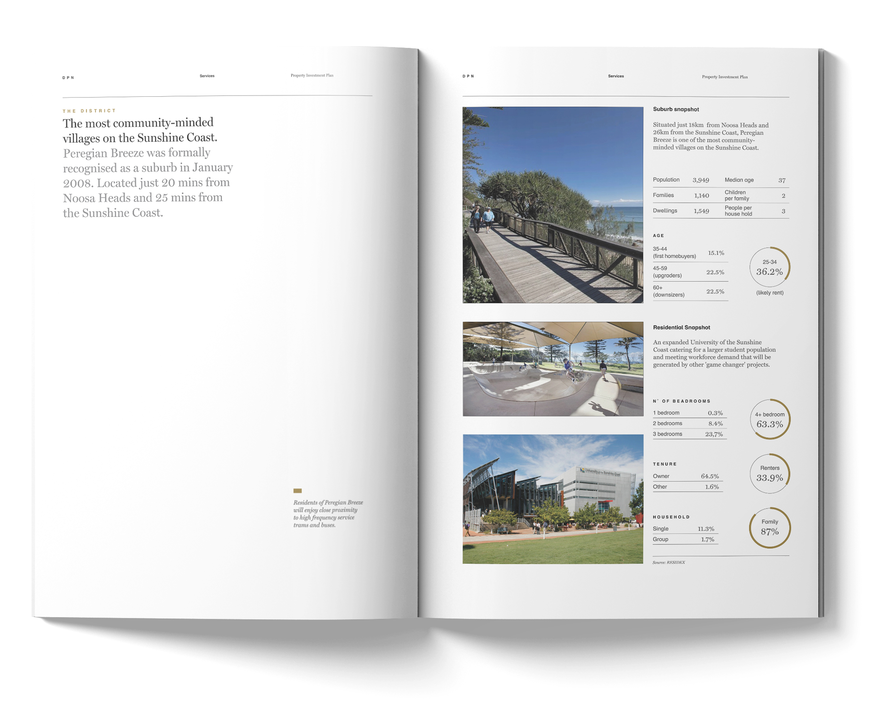
Complex made simple
Charts and table are used to create a clear visual hierarchy to help the reader focus on the data that matters.
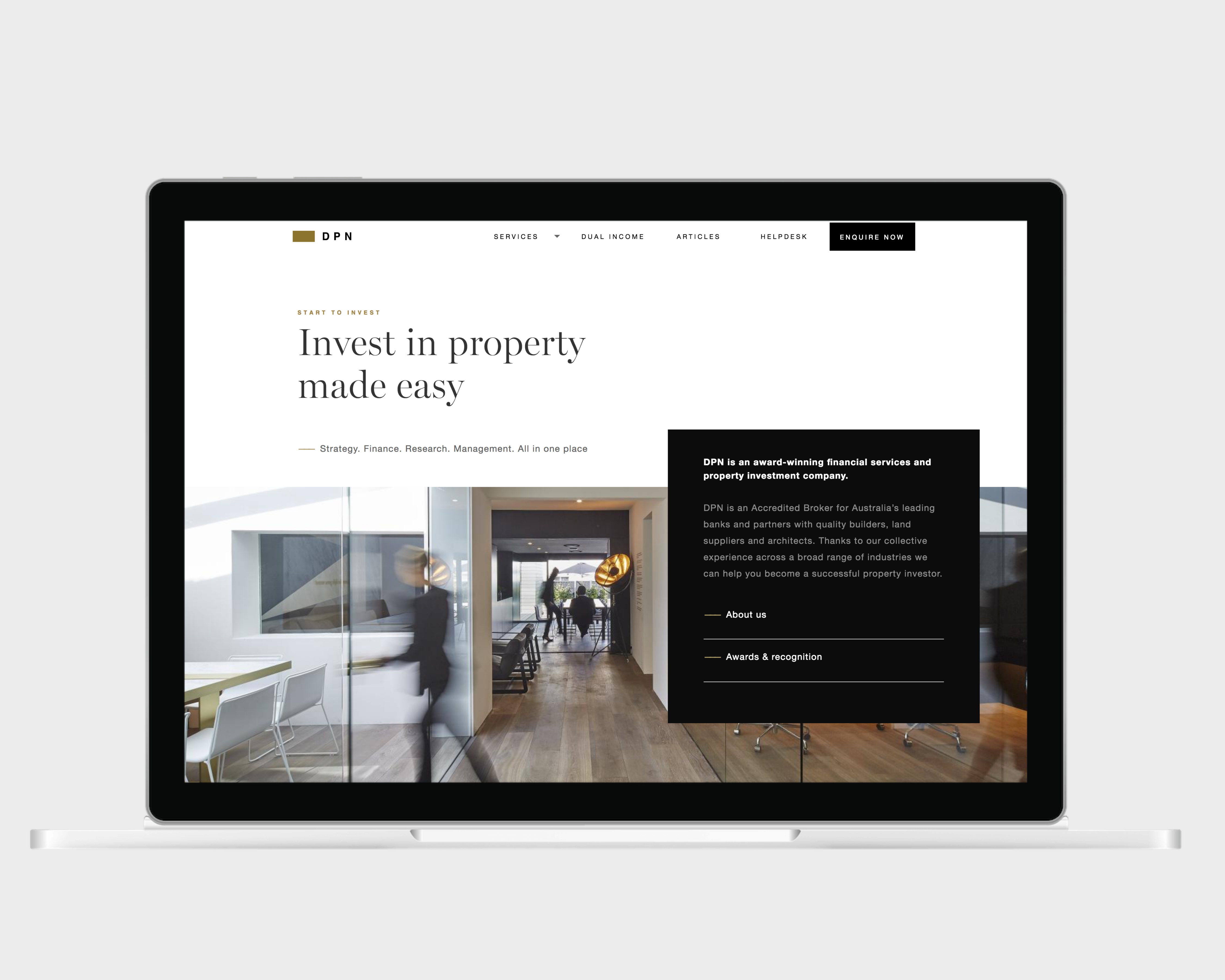
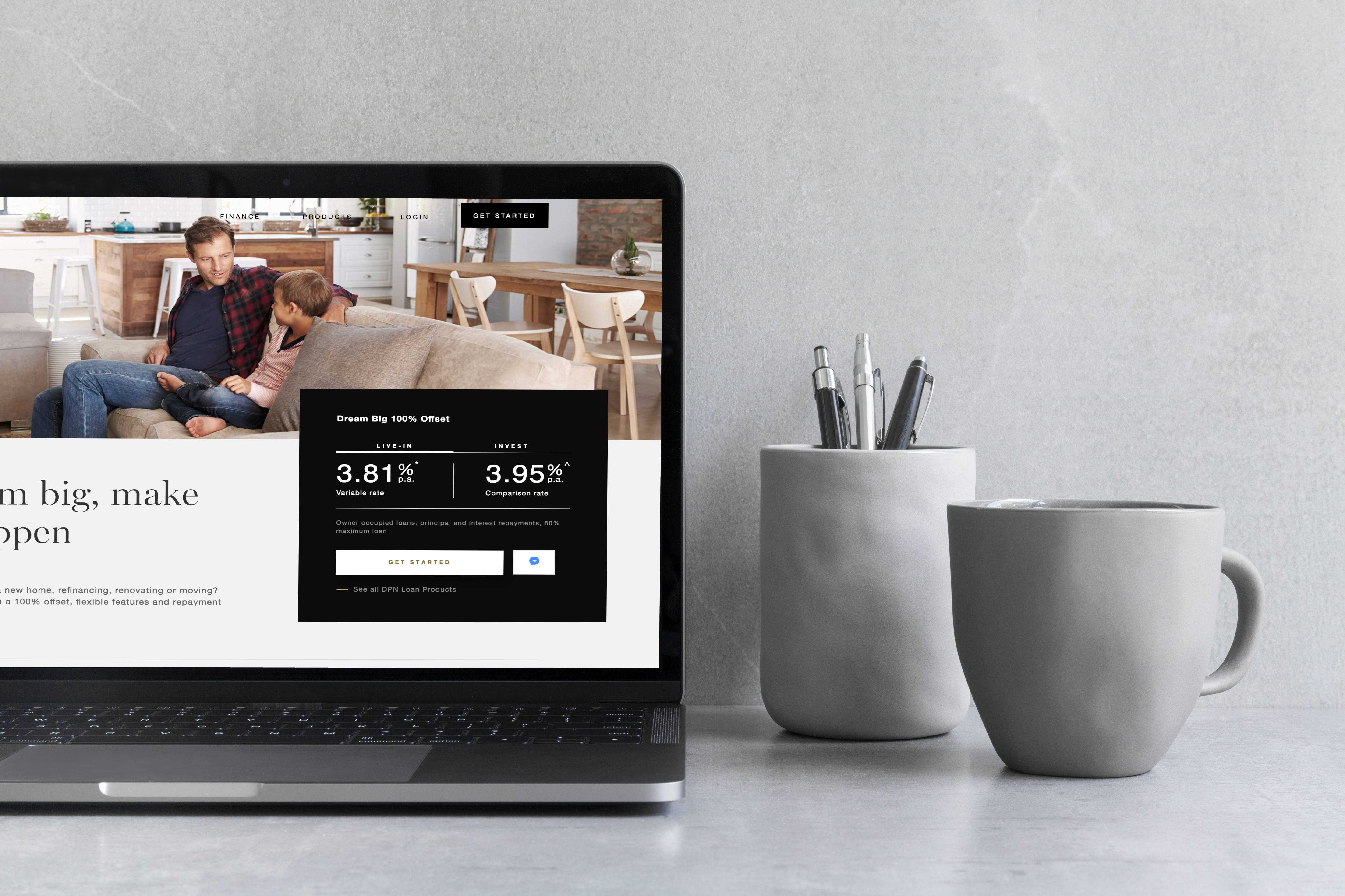
Website
The website redesign was required to promote the wide range of services offered by the company and increase the conversion rate.
Related projects
DPN — Website
 Complex struture easy to navigate
Due to the holistic nature of DPN business, the website required a complex structure. The design focused on creating a user-friendly interface and an easy to navigate website.
.
CMS
A powerful back-end system to update and easily manage all the contents of the website has been developed in Drupal.
A powerful back-end system to update and easily manage all the contents of the website has been developed in Drupal.

Strategy page — full view